Sunday, June 21, 2009

Sunday, June 14, 2009
WYSIWYG

The first WYSIWYG (What You See Is What You Get) that I encountered was the Compugraphic 4800, ca. 1983. It was a standalone module with built-in keyboard. After having command-keystroked the job, the operator could then display it in WYSIWYG form.
Shown above is the typescript of an original typewriter poem a former student of mine composed as a class assignment in 1969.
The handwriting alongside the poem is the markup I gave the Compugraphic 4800 operator. The obvious typeface to have used was American Typewriter, but for some reason—delirious, no doubt, from a bad case of “serious-osity”—I called for Zapf International Light. Today I would call for Schmutz or FF Trixie.
The tree displayed in orange on the screen. The refresh rate of the 4800 was slow, and it took approximately thirty seconds to “draw” the tree. As the image displayed from the top down, one could not “grow” the tree. And as my impulse for setting the tree in the first place was the potential for interactive effects, I did not continue along these lines.
When I informed the operator of this decision, she gave me her absolute best “I could have told you so” world-class smile.
Saturday, June 6, 2009
First Contact

I have finally posted an email contact. I had to prevail upon a good friend of mine to get the html code for it.
As I keyed the code in, I was reminded of the coding for the Alphatype CRS 99000, one of the last phototypesetting systems. So I asked a former co-worker to help me piece together, as best she could remember, the code for a typical typesetting job. It has been nearly twenty years since either of us had used a Multiset keyboard, so the result shown above may not be entirely accurate.
To begin with, it was necessary to key in the relevant typographic parameters. What is not apparent however is that the monitor that displayed the code and accompanying copy was not a WYSIWYG. So imagine setting a six-column spread with the copy wrapping around fishing lures, rods and reels, even creels with a hapless fish sticking out, (and we are not talking picture boxes with automatic text wrap, but text indents keyed in left and right); then ending the last column with the logo and servicemark copy. And I want you to know all six columns had to fill, and both top and bottom align. No carding allowed—“carding” being the nefarious practice of add-leads or inconsistent leading to fill to column depth of adjacent columns.
Well, here is one of those ads.

With only the Multiset counting keyboard to warn of an overset line, first a white bullet displayed, then a second, then a third, and finally a clangorous bell, sounding like a garbage truck backing up, the operators were able to visualize the job taking shape. On many occasions jobs came off the printer close enough that I could have signed off on them—although the Rapala fishing lure ad probably went through ten or twelve alterations under the meticulous eye of an agency art director.
So the question remains: Who were these operators? Good time for all you gender studies people to start sharpening your quills.
Thursday, April 23, 2009
Poco Proof Press No. 1534

If you look back to the post “You’ve Got A Line Gauge, Don’t You?” you’ll see that the last line of copy reads: printed on Poco proof press No. 1534.
Well, pictured above is Poco proof press No. 1534 with the printer himself (ca. 1982) inking a rule by hand.
I had two presses before I got the Poco, but the first press that I used seriously was the Poco. I attached grippers and guides to the cylinder. I also rigged a hinged, sloped feeding table with a side-guide. As the press was designed for pulling newspaper proofs from a galley and would print on the return, the feeding table was hinged so that it could be lifted up and allow the gripper-mechanism to clear on the return stroke. Also you will notice a blank sheet just behind the dead line; on the return stroke I lay that over the form so that the tympan would not get printed.
I was spoiled, of course, having first learned to print using a top of the line Vandercook SP15 with automatic inking. Unfortunately the Poco did not have automatic inking, and I had to learn how to ink by hand, with a brayer running on removable roller bearers (also shown).
But more about inking by hand in some future post.
Monday, April 20, 2009
mouse type

In the trade 6- and 7-point type is known as mouse type. Its primary use is for legal copy not really intended to be read—such as disclaimers or copyright notices.
What brings this to mind is that recently I was setting by hand some 8-point Libra. I hadn't set a small point size in a long time, but it went well enough. Problems began in earnest, however, when I started setting some 6-point (A) Microgramma Extended (the A 6-point size being 2.5-point cap height on a 6-point body). I finally resorted to using a magnifying glass and a tweezers.
Pictured is a figure font of 48-point Microgramma Extended. Look closely at the gap in the second line. See that tiny something between the figure one and the figure nine? That’s a figure one from 6-point (A) Microgramma Extended.
When you are working onscreen in a graphics program the deception of these ratios is not so obvious. 800 percent may not seem like much onscreen, but I am offering up this photo as proof that a six-point body can be very hard to see.
Now imagine trying to read the 2.5-pt cap height printed letter on a business card, and then in an “ambiance-lighted” restaurant or bar. (The 2.5-point cap height against the 40-point cap height on the 48-point body having doubled the magnification to 1600 percent.)
Hopefully no one would ever set type that small for a business card.
So the question remains: Why was I setting type so small?
Friday, March 13, 2009
Straight-up, Water-back
Recently I was downsizing a line drawing in Illustrator and failed to mark the stroke to decrease at the same percentage as the image. The overall density of the image increased so much that it was unusable.
This is a proportion problem that becomes quite apparent when a text face is enlarged to poster size and its refined serifs become cumbersome slab serifs.
But I am thinking more in terms of format, as might be encountered in packaging, where usage crosses over from a tiny label on a half-pint bottle to a label on a gallon bucket. An excellent example of this can be seen in the Knob Creek Kentucky Bourbon label.
The label on the pint maintains a delicate balance, where the color planes and density of the typefaces strain to overwhelm the white background, while at the same time the white border holds the design in place. Compare this to the very same label scaled up and applied to the liter bottle, where the density of line and color is lost through dispersal of the graphic elements, and the increased whiteness of the label is the graphic equivalent of a watered-down drink.
Unfortunately you will have to find your own liter bottle, as I do not have a picture of it. In real life, though, it can often be found displayed behind the bar, on its side and resting in a cradle.
Should Knob Creek not appeal to your taste you might take up the typographic study of wine labels. Note the considerable difference in type selection between, say, an emblematic Haut Medoc and a Friday-Casual Zinfandel.
Salut!
This is a proportion problem that becomes quite apparent when a text face is enlarged to poster size and its refined serifs become cumbersome slab serifs.
But I am thinking more in terms of format, as might be encountered in packaging, where usage crosses over from a tiny label on a half-pint bottle to a label on a gallon bucket. An excellent example of this can be seen in the Knob Creek Kentucky Bourbon label.
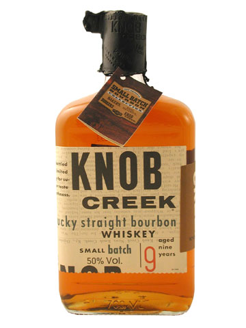
The label on the pint maintains a delicate balance, where the color planes and density of the typefaces strain to overwhelm the white background, while at the same time the white border holds the design in place. Compare this to the very same label scaled up and applied to the liter bottle, where the density of line and color is lost through dispersal of the graphic elements, and the increased whiteness of the label is the graphic equivalent of a watered-down drink.
Unfortunately you will have to find your own liter bottle, as I do not have a picture of it. In real life, though, it can often be found displayed behind the bar, on its side and resting in a cradle.
Should Knob Creek not appeal to your taste you might take up the typographic study of wine labels. Note the considerable difference in type selection between, say, an emblematic Haut Medoc and a Friday-Casual Zinfandel.
Salut!
Tuesday, March 10, 2009
A Third Hand

Bicycle shops use a tool called a “Third Hand” for keeping spring-loaded brake calipers closed while tightening brake cables. Anyone who has ever fought to reposition a plate on a magnetic base may well have wished for a third hand.
Here is my idea for a third hand: a squeegee used for laying down pressure-sensitive sticky-backs such as vinyl.
Pictured is a Bunting Magnetic Cerface™ Base with a four-inch plate mounted on it. A squeegee has been inserted under it, so that only the upper right-hand corner is drawn to the base, and allowing the plate to pivot easily.
Because the squeegee is wedge-shaped it can be used to keep a plate standing in position, while you take a line gauge and measure from the top of the base (carefully) to a baseline on the plate and then reposition the plate with your, suddenly, free hand. The wedge can also be used as a sled for sliding a plate left or right or to “float” it up or down.
Admittedly the squeegee is small and works best with small plates (up to 5x8 inches), but that covers a lot of instances; and in my case, that’s a lot of instances, as I print a lot of small plates.
Also shown is a dull graver used for lifting up the plate edge, and an additional squeegee for the full squeegee effect. I am, of course, violating press protocol, of not putting anything on the press bed higher than type high. So be sure to clear the decks.
And best of all: a squeegee like this can be found at almost any graphics supply shop for about a dollar.
Subscribe to:
Posts (Atom)